
Ultimate List of Facebook Cover Photo Examples
Nobody visits a Facebook page to admire the cover photo. But more than 3 billion people open Facebook every month, according to Meta’s own investor data, and every one of them scrolls past your cover photo before they read a single post.
About 98.5% of them are doing that scrolling from a phone, per recent mobile usage data. That’s exactly why your cover photo needs to survive a brutal mobile crop before anyone sees it whole.
Get it right and your whole page feels intentional. You’ve got that space either way. You might as well make it count.
Getting the Fundamentals Right
Facebook shows your cover photo at 820 by 312 pixels on desktop, then crops it tighter on mobile. Keep your logo, faces, and text inside the middle safe zone, or mobile users won’t see them.
- Design for mobile first. That’s where most people will actually see it.
- Skip the paragraph. One good line beats a wall of text every time.
- Match your cover to your profile photo, so they don’t look like two different brands.
- Change it up when something real happens: a launch, a season, a milestone.
- Skip the stock photos. Nobody’s fooled, and everybody’s seen that handshake picture before.
Alright, here are some brands doing something worth stealing with that space.
15 Best Facebook Cover Photos/Banner
Here are some standout examples of Facebook cover photos worth taking inspiration from:
1. Zendesk
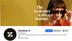
The Angle: Copy-First Humor
Zendesk builds customer service software, the kind of product that usually gets sold with dashboards and jargon. Their cover photo says forget all that.
A woman winks behind sunglasses on a mustard-yellow background. The line underneath does the heavy lifting: ‘The customer is always human.’
It’s a pun on an old cliché, and it works because Zendesk’s whole pitch is support that feels human, not robotic. The banner is basically the sales pitch in one image.
2. Equinox
The Angle: Shock Contrast
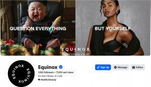
Equinox sells expensive gym memberships to people who want fitness to feel like a personality trait. Their cover leans all the way into that.
It splits the frame in two. A screaming toddler dressed like a dictator takes one side. A model in sleek workout gear takes the other, under the caption ‘Question everything. But yourself.’
It’s unhinged, but so is paying $300 a month for a treadmill with a view. The chaos works because Equinox’s whole brand is being a little extra.
3. Claude
The Angle: Mood Over Screenshot
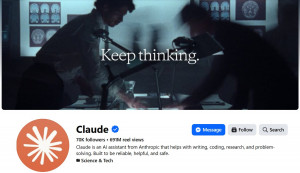
Claude is an AI assistant from Anthropic, built for writing, coding, and thinking things through. Its cover photo skips the software talk entirely.
It looks like a still from a slow-burn thriller. Two blurred figures hunch over brain scans, with the tagline ‘Keep thinking’ underneath.
There’s no chat window, no demo, nothing that screams product. It reads more like a mood board for a brain, which tracks for a company obsessed with how AI actually thinks.
4. Etsy
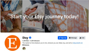
The Angle: Process Over Polish
Etsy is the marketplace where people buy and sell handmade and vintage goods instead of mass-produced stuff. Their cover photo puts the receipts front and center.
It’s four close-up shots of hands mid-craft: dyeing fabric, twisting rope, hanging cloth to dry. No polished product shots, no logos, just people actually making things.
It might be the most on-brand banner on this whole list. Etsy’s entire business is a bet that handmade still means something, and the cover photo says so without a single word of copy.
5. GEICO
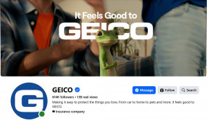
The Angle: Mascot Takeover
GEICO sells car, home, and pet insurance, a category most people actively avoid thinking about. Their cover photo hands the whole banner to the one character that’s made insurance feel less boring for two decades.
The Gecko stands front and center in a candid, slice-of-life moment, blurred people in the background, plant in the corner, like he just wandered into someone’s living room. “It Feels Good to GEICO” sits right above him in bold white type.
When your mascot has this much recognition, you don’t need a product shot or a rate comparison. You just let him show up, and the whole brand registers instantly.
6. Intuit Mailchimp
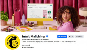
The Angle: Lifestyle Staging
Mailchimp helps businesses run email and text campaigns without hiring a whole marketing team to do it. Their cover photo sells the lifestyle as much as the software.
A woman glances back at a monitor mid-automated-email-journey. The desk is styled like a lifestyle shoot: a plant, lip gloss, and a yellow water bottle.
The product screenshot is real, not a mockup, which is a nice touch. It’s basically saying, yes, this is marketing software, but make it aesthetic.
7. Asana
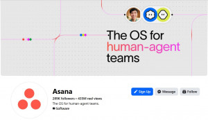
The Angle: Diagram as Brand
Asana makes work management software, the kind of tool teams use to avoid living in spreadsheets forever. Their cover trades screenshots for something stranger.
It’s a dotted grid with thin colored lines running through it, like a subway map. Small circular icons drift along the paths. The headline cuts across it: ‘The OS for human-agent teams.’
There’s no product screenshot here, and no bullet list of features either. The diagram is the pitch: work moving through a system, humans and AI agents included.
8. Royal Scottish National Orchestra
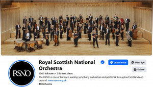
The Angle: Documentary Gravitas
The RSNO is one of Europe’s leading symphony orchestras. It plays concert halls, not festival stages, and its cover photo knows exactly what room it’s in.
Forty-plus musicians stand in formal black, instruments raised, mid-performance on a grand wooden stage. No jokes here, and none needed.
Some brands earn credibility with a punchline. This one earns it by showing up looking exactly this serious, and letting the scale do the talking.
9. Nike
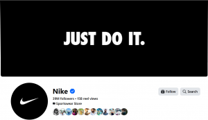
The Angle: Typographic Minimalism
Nike sells sneakers and sports gear to basically everyone on the planet. It stopped needing to explain itself decades ago.
Their cover is three words in bold white type on a plain black background: ‘Just Do It.’ No shoes, no athletes, no product in sight.
When you’re this famous, the banner’s only job is reminding people you still exist. Nike does that in four words and a lot of empty black space.
10. LeadsPanda
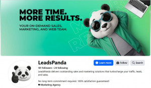
The Angle: Personality First Branding
As a B2B company, LeadsPanda could easily have gone with a typical corporate banner: services listed out, a screenshot or two, maybe some generic business imagery. Instead, the cover photo hands the whole space to a character. A panda in sunglasses and a track jacket leans back against a solid green background, its relaxed pose giving the brand a personality you can actually picture.
The copy stays out of the way too: “More Time. More Results.” Two lines, the whole value proposition, no crowding the design.
That’s why it works. A distinctive character paired with a simple promise is easy to recognize and remember, proof that a B2B brand doesn’t have to look corporate to be taken seriously.
11. Hubspot
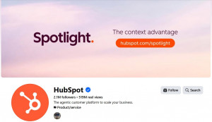
The Angle: Campaign Billboard
HubSpot builds the CRM and marketing platform millions of businesses run their customer relationships on. Their cover photo isn’t really about the page at all, it’s an ad for something else entirely.
A soft pastel sky fills the frame, with “Spotlight.” in bold serif type on one side and “The context advantage” paired with a direct link on the other. It reads exactly like a product launch billboard, because that’s exactly what it is.
Most brands use this space to say something about who they are. HubSpot uses it to sell you on where to click next, and treats the cover photo like free ad real estate.
12. Liquid Death
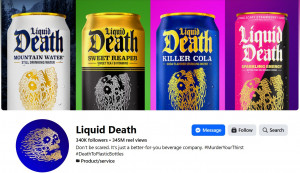
The Angle: Full Lineup as Wallpaper
Liquid Death sells canned water and tea to people who’d never buy canned water or tea if it looked like canned water or tea. Their cover photo is basically a flex of the whole product wall.
Four cans, four wildly different neon backgrounds, all sharing the same metal-band logo and screaming skull mascot. No tagline needed, the design does all the talking.
It works because the brand’s entire pitch is “what if healthy drinks looked terrifying instead of wholesome.” Lining up the flavors like a merch drop makes that bet obvious at a glance.
13. Spotify
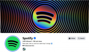
The Angle: Logo as Sound Wave
Spotify streams music to a user base that lives and dies by algorithms and playlists. Their cover photo turns the logo itself into something that feels like sound.
Concentric rainbow rings ripple outward from the Spotify icon like a vinyl record or an audio waveform, set against total black. No product screenshot, no artist names, just the logo pulsing outward.
It’s the kind of banner that only makes sense for a brand this recognizable. When your icon alone can carry the whole design, you don’t need a copy, you just make the logo do something visually hypnotic.
14. Rebecca Yarros
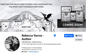
The Angle: World-Building Preview
Rebecca Yarros is a bestselling fantasy romance author, the kind of writer whose fans camp out for release dates. Her cover photo skips the headshot-and-quote formula entirely and hands the whole banner to the book itself.
A dragon soars over a hand-drawn skyline in scratched-up black and white, with the tagline promising “thirteen unforgettable stories” and a mysterious “don’t die” scrawled below. Off to the side, the actual book mockups sit under a plain “COMING SOON!”
It’s part movie poster, part countdown clock. For an author whose whole business is getting readers invested in a world, that’s a smarter use of the space than a photo of her at a desk.
15. Oatly
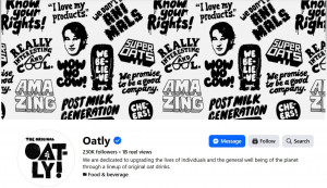
The Angle: Brand Voice as Wallpaper
Oatly makes oat milk for people who’ve read the carton and can quote it back. Their cover photo skips product shots entirely and turns their own catchphrases into the design.
Black-and-white slogans tile edge to edge, “Wow No Cow,” “Post Milk Generation,” “We Promise to Be a Good Company,” repeated like wrapping paper, alongside a sketchy cartoon face that’s become part of the brand’s identity.
It works because Oatly’s whole personality lives in its copy, quirky, self-aware, a little chaotic. Making the words themselves the visual is the most on-brand thing a plant-milk company could do.
The Bottom Line on Facebook Cover Photos
None of these covers came from a template, and it shows. Each one leans into one thing, humor, contrast, scale, or restraint, and just commits.
Figure out which lever fits your brand, then build the rest of the design around it. Or steal one of these outright. We won’t tell.
Share This Story
About the Author: Supriya Joseph

Related Posts


Get the latest growth ideas, strategies, and best practices delivered to your inbox.
Quick read that helps 7000+ subscribers.