Table of Contents
Introduction
An infographic is a visual representation of information, data, or knowledge that is designed to be both attractive and easily understandable. It combines elements such as text, graphics, charts, and images to present complex or detailed information in a simple and concise manner.
Infographics are often used to present statistical data, trends, or facts, making it easier for viewers to quickly grasp key points and comprehend the message being conveyed. They are commonly used in fields like marketing, education, business, and journalism, where the goal is to communicate information effectively and engage the audience visually.
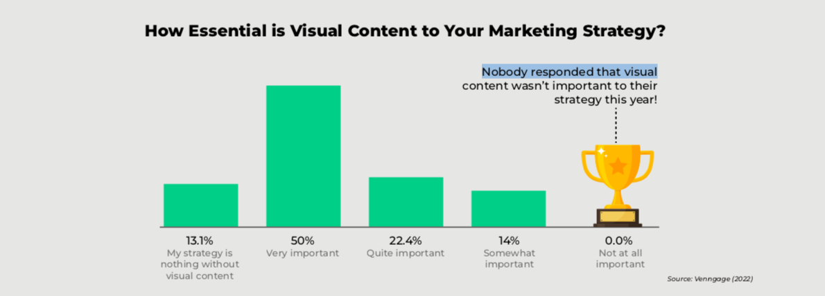
More than half of marketers said that visual content is very important to their overall marketing strategy. It is no longer acceptable for marketers to rely on traditional forms of advertising and information delivery to reach their audiences. This is particularly true since the vast majority of Americans regularly consume content on social media.
Infographics are popular because they are visually appealing, engaging, and can present information in a way that is easily shareable across different platforms and social media.
Chapter 1: Why Create an Infographic?
Infographics allow companies to share data in a way that is simple, engaging, and easy to understand. These five reasons show why you might want to invest your marketing resources in creating and distributing an effective infographic:
1. Simplify Complex Information
Infographics are an effective way for businesses to simplify complex data, research findings, or industry trends. By presenting information in a visually appealing and concise manner, businesses can effectively communicate complex ideas or concepts to their target audience.
2. Enhance Content Marketing Efforts
Infographics are highly shareable and can generate more engagement than plain text. Businesses create infographics as part of their content marketing strategy to grab attention, increase brand awareness, and drive traffic to their website or social media platforms.
3. Increase Comprehension and Retention
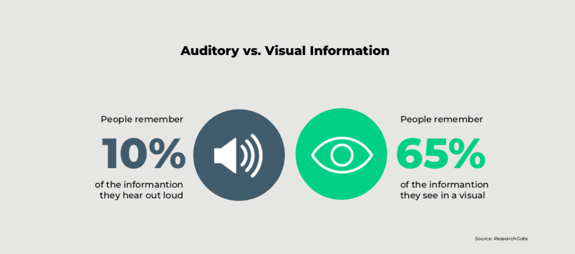
Visual elements in infographics can help viewers better understand and retain information. People remember 65% of visual information compared to only 10% of auditory information. Businesses create infographics to present data or statistics in a way that is more easily digestible, allowing their audience to quickly grasp key concepts or insights.
4. Showcase Expertise and Thought Leadership
Infographics provide an opportunity for businesses to establish themselves as industry experts. By creating visually compelling and informative infographics, businesses can demonstrate knowledge, expertise, and innovative thinking in their respective fields.
5. Increase Social Media Presence
Infographics are highly shareable and can quickly gain traction on social media platforms. By creating visually appealing and informative infographics, businesses can increase their social media presence, attract new followers, and expand their reach to a wider audience. Infographics can also help businesses improve engagement on social media sites.
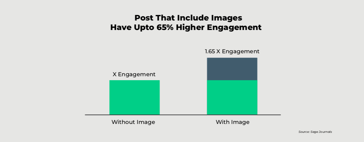
Posts that include images have been reported to deliver up to 65% higher engagement compared to posts that simply contain text. This can ultimately lead to increased brand visibility, website traffic, and potential customer acquisition.

Instant amazon bestseller
The one-page content marketing blueprint
Chapter 2: What Makes an Infographic Great?
All great infographics share a few characteristics. Identifying these characteristics will give you the insight you need to create and share content more effectively.
a) A Single Key Message
One feature of an effective infographic is that it has a single key message—one main idea or concept that the infographic is trying to convey. By having a clear and concise message, businesses can ensure that their audience understands the main point they are trying to communicate. This helps avoid confusion and allows viewers to quickly grasp the intended takeaway from the infographic.
b) Relevant and Accurate Data
Providing relevant and accurate data is crucial for building credibility and supporting the message of the infographic. Data can be presented in the form of charts, graphs, or statistics. By using clear and specific details, businesses can provide evidence and support for their claims or statements, making the infographic more informative and trustworthy.
c) An Engaging Story
Infographics that tell a story or present information in a narrative format are more engaging and memorable to the audience. Using storytelling elements such as a beginning, middle, and end, or a problem-solution approach can make the information more relatable and easier to comprehend. By incorporating a story into the infographic, businesses can captivate the audience’s attention and create a more meaningful connection.
d) Clear Structure
A well-structured infographic ensures that the information flows logically and is easy to follow. It’s important to organize the content in a coherent manner, using headings, subheadings, and sections to break the information down into digestible chunks. This helps keep the audience’s attention and allows them to navigate through the infographic smoothly without feeling overwhelmed or lost.
e) Visual Appeal
The visual aspect of an infographic is what makes it instantly appealing and attention-grabbing. Color, typography, icons, and illustrations can enhance the visual interest of the infographic and make it more memorable to the audience. Visuals also help simplify complex information by presenting data or concepts in an instantly engaging and easy-to-understand format. When designed effectively, visual elements can quickly convey information, evoke emotions, and leave a lasting impression.
Chapter 3: What Are the Different Types of Infographics?
There are many different types of infographics that you can create depending on the type of data you wish to share with your audience. The following are some of the most common types you should be aware of:
1. Timeline
A timeline infographic provides a visual representation of events or milestones in chronological order. It typically includes dates and brief descriptions to help viewers easily understand a sequence of events. Timeline infographics are useful for showcasing historical developments, project timelines, or personal achievements.
What Does a Timeline Infographic Look Like?
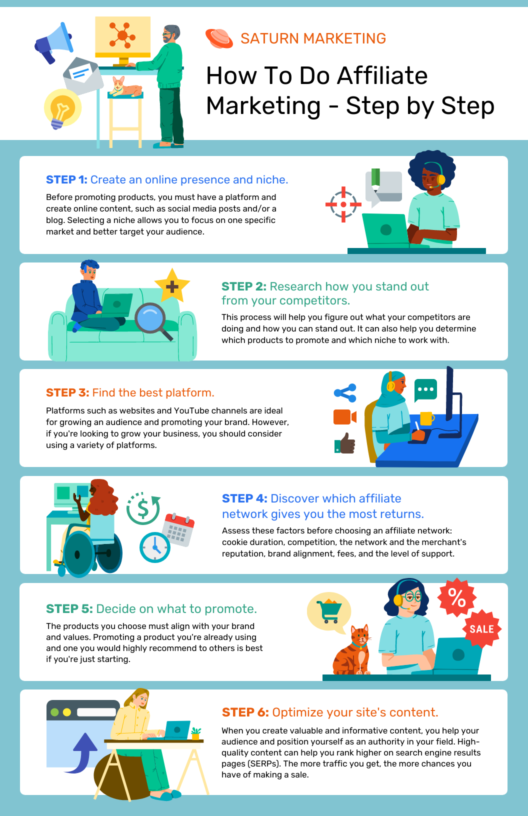
2. Process or How-To
A process infographic breaks down a complex concept or step-by-step procedure into easily digestible visuals. It uses icons, arrows, and text to guide viewers through each stage of the process. How-to infographics are commonly used for instructional purposes, explaining recipes, DIY projects, or complex workflows.
What Does a Process Infographic Look Like?
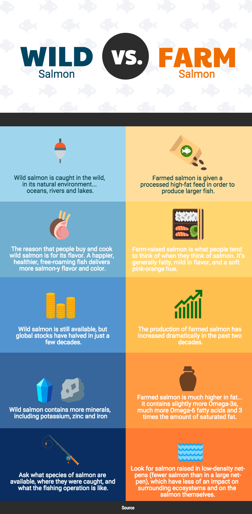
3. Comparison
A comparison infographic allows viewers to compare multiple elements, products, or categories. It presents information side by side to highlight similarities and differences. Comparison infographics often use charts, graphs, or visually striking elements to make the contrast more understandable and engaging.
What Does a Comparison Infographic Look Like?
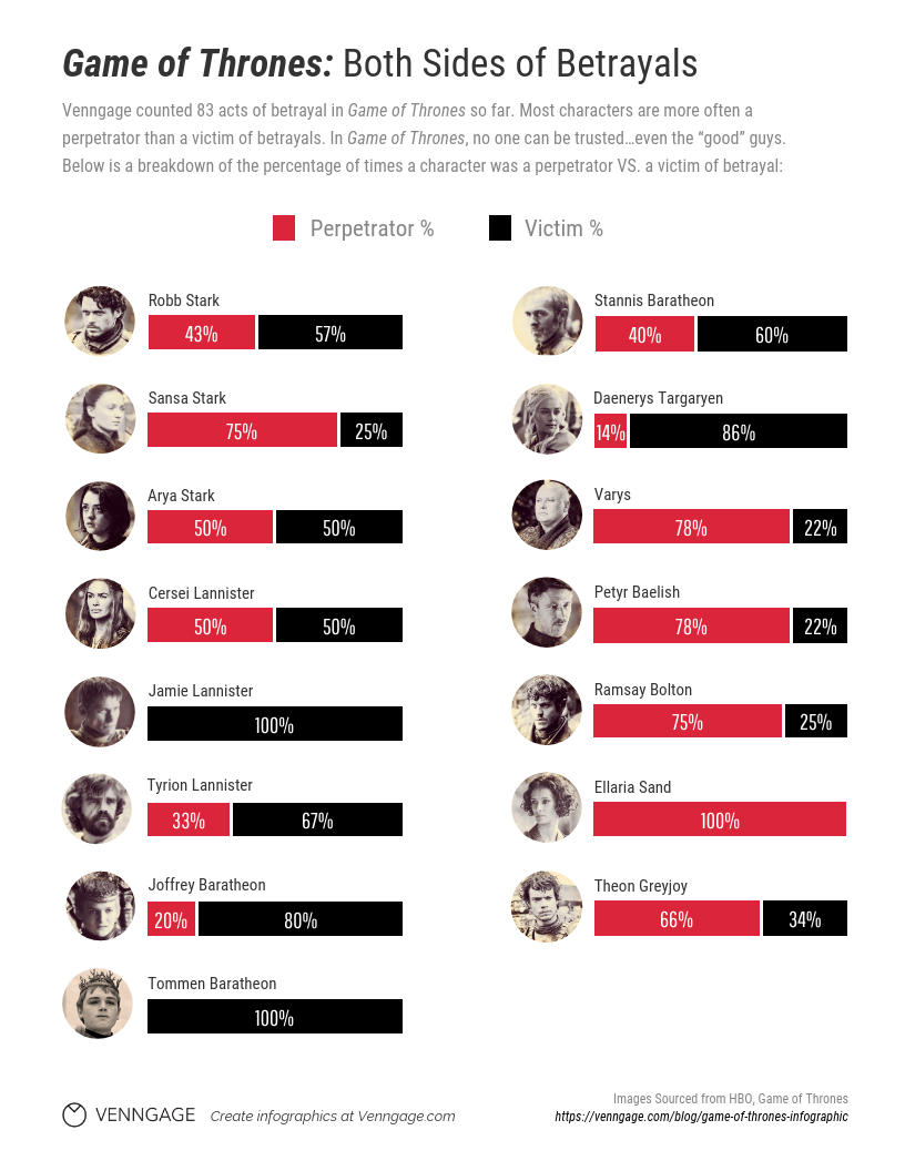
4. Statistics
A statistical infographic focuses on presenting statistical data or facts in a visually appealing format. It uses graphs, charts, and diagrams to organize and represent quantitative information, making it easier for viewers to comprehend complex numbers and trends. Statistic infographics are frequently used in reports, presentations, or articles to support data-driven arguments.
What Does a Statistical Infographic Look Like?
5. List
A list infographic presents information in a list format, using visual elements to enhance the presentation. It condenses a significant amount of information into bite-sized points, making it easier to read, understand, and remember. List infographics are suitable for showcasing rankings, top-10 lists, or summarizing key points for quick reference.
What Does a List Infographic Look Like?
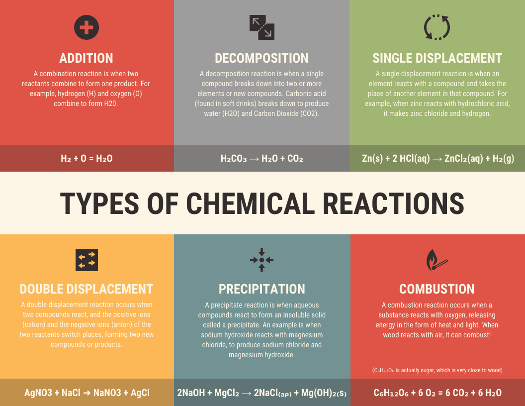
6. Informational
An informational infographic provides a comprehensive overview of a topic or subject, condensing large amounts of information into a visually engaging format. It can include text, images, icons, and charts to convey key points, facts, or statistics. Informational infographics are useful for educational purposes, explaining concepts, or summarizing complex reports in a concise and understandable manner.
What Does an Informational Infographic Look Like?

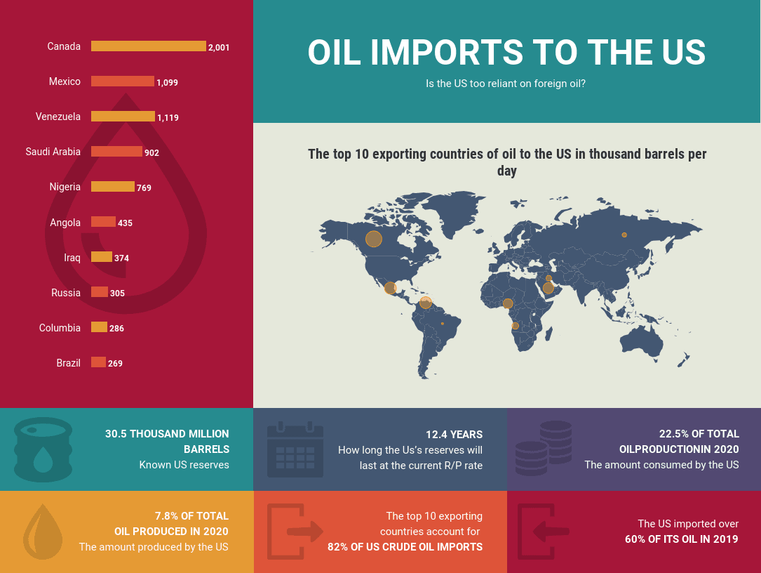
7. Geography or Map
A geography or map infographic visually represents geographical data, incorporating maps, icons, and text to convey specific information about a location. It can showcase demographics, population density, climate, or any other relevant geographical data. Geography infographics are commonly used for tourism, educational purposes, or to illustrate regional differences and trends.
What Does a Geographical Infographic Look Like?
Get the latest growth ideas, strategies, and best practices delivered to your inbox.
Quick read that helps 7000+ subscribers.
Chapter 4: 8 Steps to Create an Amazing Infographic
While every business that uses infographics aims to create amazing visuals and share insightful information, not every infographic succeeds in doing so. Follow these eight steps to ensure that you are creating the most impactful infographic you can:
Step 1: Define Your Target Audience
Before you start creating an infographic, it’s essential to understand who you are creating it for. Determine the demographics, interests, and needs of your target audience. This will help you tailor the content, design, and tone of your infographic to resonate with your ideal viewers.
Step 2: Define Your Goals
Clearly define the purpose and goals of your infographic. Are you trying to educate, inform, entertain, or persuade your audience? Understanding your goals will help you shape the content and design elements of your infographic to effectively convey your message.
Step 3: Choose Your Topic
Select a topic that’s relevant and interesting to your target audience. Consider what information or insights you can provide that will add value to their lives or help them solve a problem. Brainstorm ideas and choose a topic that aligns with your goals and the interests of your audience.
Step 4: Find the Right Data
Gather accurate, reliable, and relevant data that supports your chosen topic. Look for reputable sources, research studies, statistics, or survey results that add credibility to your infographic. Ensure that the data is up to date and enriches the message you want to convey.
Step 5: Find the Story in the Data
Analyze the data you’ve gathered and identify the key insights, trends, or patterns that emerge. Look for the story or narrative within the data that will engage your audience. This narrative will form the backbone of your infographic and guide the content flow.
Step 6: Choose the Right Type of Infographic
Types of infographics include data visualizations, timelines, comparison charts, process diagrams, and maps. Select the type that best suits your topic and data. Consider the complexity of your data and the story you want to tell, and choose a format that presents the information clearly and effectively.
Step 7: Write Copy for Your Infographic
Craft concise, compelling, and informative copy that complements the visual elements of your infographic. Use clear headings, subheadings, and short paragraphs to convey the main points. Make sure the language you use is accessible to your target audience and supports the goals of your infographic. Keep it short.
Step 8: Design Your Infographic
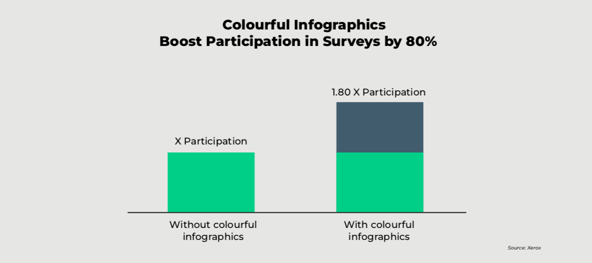
Create an engaging and visually appealing design that aligns with your brand or message. Use colors, typography, icons, and images to enhance the visual impact of your infographic. Strategic color usage can make your infographic more engaging. Recent research shows that colorful infographics can help you boost participation in surveys by 80%.
Ensure that the design elements are organized and structured in a logical and intuitive way, guiding the viewer’s eyes through the information.
Chapter 5: Publish and Promote Your Infographic
Once your infographic is created, it’s critical that it is shared in a way that puts your content in front of your most-valued audiences. There are three channels you should always consider when publishing and promoting your infographic:
1. Owned Channels
Distributing an infographic on owned channels, such as company websites and social media profiles, can help you effectively reach your target audience. You already have direct control over these channels and can ensure that the infographic is readily available to your existing followers and website visitors.
Utilizing owned channels allows for immediate exposure to a receptive audience who have already expressed interest in the content. Additionally, these channels provide the opportunity to optimize the visual presentation of the infographic to align with the brand’s overall image and messaging, maximizing engagement and interaction with the audience. Here are some tips for how you can use owned channels to distribute your infographic:
-
- Publish the infographic on your website or blog.
- Share the infographic on your company’s social media profiles.
- Include the infographic in your email marketing campaigns.
2. Earned Channels
Earned channels include online publications, news outlets, and industry influencers who share or feature the infographic organically. When others find the infographic compelling and relevant, they may share it on their own platforms, expanding its reach to their audiences.
This amplification through earned channels can enhance credibility and trust, as the infographic is being shared by unbiased third parties. By leveraging earned channels effectively, you can tap into new segments of your audience who may not have been initially reached through owned channels. The following strategies can help you use earned channels more effectively:
-
- Reach out to websites and blogs in your industry and ask if they would be interested in sharing your infographic with their audience.
- Look for opportunities to submit your infographic to relevant directories or websites like Visual.ly or Infographic Journal.
- Consider using a press release to distribute your infographic to media sources.
3. Paid Channels
By investing in paid ads on platforms like social media, search engines, or content discovery networks, you can reach a larger audience that may not be familiar with your brand or content.
Paid channels offer precise audience targeting options, allowing the creator to narrow down their reach to specific demographics or interests, ensuring the infographic reaches the most relevant audience.
While paid distribution requires a budget, it can provide immediate visibility, expand brand awareness, and generate potential leads or conversions. Distribute your infographic through paid channels with the following tips in mind for the best results:
-
- Run social media advertising campaigns using the infographic as the ad creative.
- Use paid distribution tools like Outbrain or Taboola to promote your infographic on other websites.
- Consider using influencer marketing to get your infographic in front of a larger audience.
Make Your Point With an Effective Infographic
Throughout this eBook, we’ve shared valuable insights into the key principles, techniques, and strategies that can make your infographics stand out in a crowded digital landscape.
We’ve explored the importance of understanding your target audience and tailoring the content and design to their needs and preferences. By choosing compelling and relevant topics, crafting strong narratives, and incorporating eye-catching visuals, you can grab attention and captivate viewers.
Furthermore, this guide has emphasized the role of data visualization in making infographics more impactful and memorable. By presenting information in a visually appealing and easily digestible format through charts, graphs, and other visual elements, you can now make even complex data accessible and engaging.
Harnessing the power of infographics is a valuable tool in today’s digital age, and with this guide at your disposal, you’re well-equipped to create infographics that stand out, get shared, and make a lasting impact. Now, it’s time to put these insights into practice and unlock the full potential of this powerful visual medium.
At LeadsPanda, we help our customers to create more engaging infographics by effectively communicating their ideas, data, or messages in a visually appealing and impactful way, ultimately captivating their audience and driving engagement.
Find out how LeadsPanda can help you with your content needs.
