5 Reasons Why Your eCommerce Landing Page Isn’t Helping Your Conversions

What does it take for your landing page to deliver the conversions that you need?
- A good offer that will pique your audience’s interest.
- A landing page that is aligned with that offer.
- Marketing efforts that take your users through your conversion funnel.
But you’ve already done all that—and still your leads don’t seem to be converting. Why? Start by ruling out any technical problems on your landing page might have. Once you’ve done that however and your customers are still bouncing, then it might be time to look into other factors that may be causing this.
Here are some of the most common questions you should ask yourself if your landing page isn’t helping you with your conversions—
1. Is your landing page mobile-responsive?
Landing pages, especially for ecommerce sites, are typically action oriented; meaning you want your leads or potential customers to sign up for something or make and complete a purchase. Now, this will require you to create a landing page that will allow them to do this easily—and you probably already did. The question now is, is the experience still the same if they are viewing your site on a tablet or a smartphone?
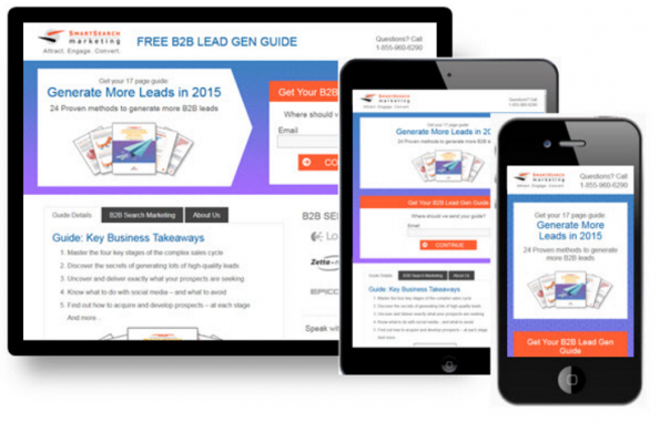
As users go increasingly mobile, it’s even more important to ensure that your site is mobile responsive. (Image Credit: Searchengineland)
Check to make sure that:
- The buttons on your site aren’t too small.
- The text is readable.
- All dropdown menus and form fields work properly regardless of what device they are using.
Pick up your smartphone now and pull up your page to check.
2. Is your page loading fast enough?
Fact—users are very quick to abandon a site when the page loads too slowly.
In a study conducted by Portent, the reveal that “every second you shave off your site’s average page load time (without shedding page views) means an 8% improvement in page value.”
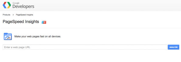
To review your landing page’s loading time—
- Go on Google’s PageSpeed Insights tool to review what factors are affecting your landing page’s load time.
- Check the speed of the company hosting your site.
- Make sure that images on your landing page aren’t too large.
3. Does your landing page explain what you want your leads to do?
Most people who end up on your landing page ended up there because they want to do something—maybe get more information about a particular product or service or company, make a purchase, sign up for a newsletter etc. etc. That said, you should make sure that you’re making it very easy for them to do so.
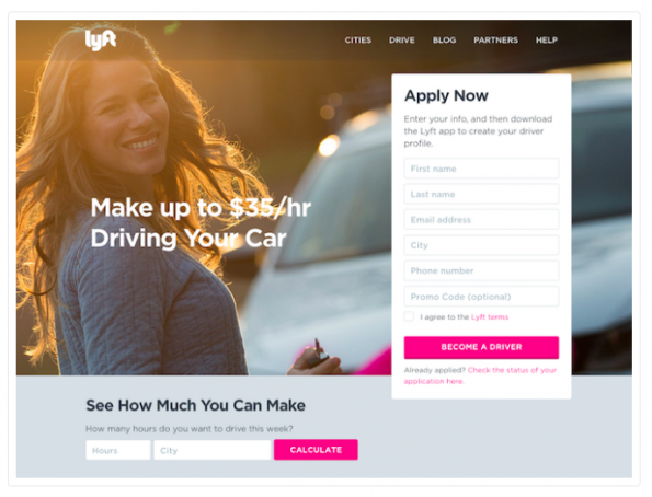
Lyft’s landing page spells out what it wants users to do next and what they get out of it once they get on their site.
Make sure that your landing page—
- Gets to the point quickly—put your call to action at the top of the page.
- Has all the relevant information users need such as details about your company, contact details, product or service information detailed.
4. Does your landing page exude credibility?
The quality of your landing page speaks volumes about your offer’s credibility. It has to create an impression that supports trustworthiness, especially if it’s an ecommerce site where you want them to make a purchase.
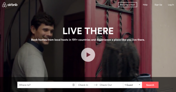
Airbnb supports their mission by offering quality visuals on their site, thus building credibility.
Avoid these common mistakes—
- Using poor quality images.
- Using unreadable fonts and garish colours.
- Being inconsistent about branding. Don’t use different versions of your company logo or product images that don’t match the descriptions.
- Not copy checking your text for typos and grammar errors.
5. Is your landing page distracting?
Don’t give in to the urge to put everything on your landing page. Sure you have a lot of options—widgets, sidebars, banner ads, comment sections, to name a few—but don’t give in to the urge of adding them all just to fill up the space. It can take attention away from what you want your customers to do on your page.
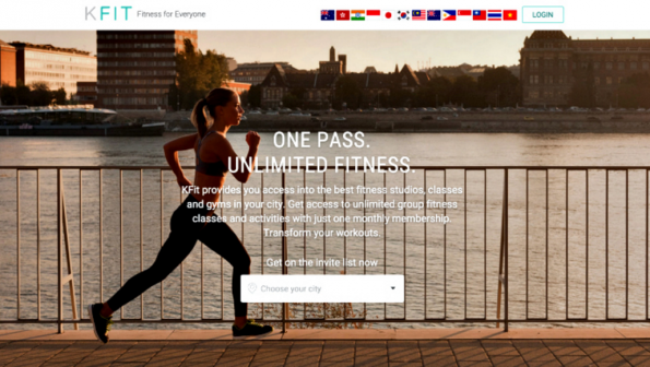
Kfit avoids all the clutter and shows how you can still communicate that you’re an innovative tech company while clearly explaining to new users what they do.
Keep the following in mind—
- Adding all these elements to your landing page can slow down your page’s loading time and may cause users to bounce from your site.
- It can distract from your call to action.
- It can turn off customers because your landing page is going to look like one big ad.
Regardless if you’re a newbie or experienced marketer, sometimes, it’s easy to miss these flaws; so give your landing page a quick review and see if you are guilty of committing these 5 common mistakes.
Did you find this guideline helpful? Let us know by leaving a comment below.
Share This Story
About the Author: Jessica Simmons
Related Posts


Get the latest growth ideas, strategies, and best practices delivered to your inbox.
Quick read that helps 7000+ subscribers.