What are the best copy for call to action buttons?
There are no hard and fast rules when it comes to writing your call-to-action (CTA) copy. It’s a combination of instinct, an understanding of your audience, and a handy reference of best practices demonstrated by some of today’s big brands.
So, to answer your question, I’ve compiled some of the best examples I’ve come across and hashed out what they did right and why they are effective.
1. Netflix demonstrates why customizing to address your customer’s needs is key
The world’s go-to streaming site has the advantage of having everyone already know who they are. However, while that simplifies the need to introduce who they are and what they do on their landing page, they needed a CTA that would communicate how easy it is to be part of their streaming service.
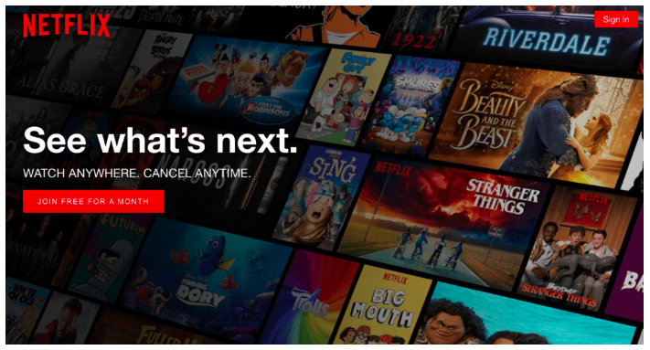
To that end, Netflix focused on highlighting their biggest advantage and addressing the biggest objective that potential customers may have about their service. Their CTA reads: “Watch anywhere. Cancel Anytime.”
Addressing potential customer pain points head-on in their CTA button should definitely help increase their conversion. They customized it to be relevant according to how much they understood their audience and created an actionable button that demonstrated they were a customer-focused brand.
2. Toms shows that urgency and intimacy work
Footwear retailer Toms was trying to promote a flash sale via online popups. The intent was to inform their loyal patrons about the limited time only event. To that end, they needed to inform efficiently, time the announcement perfectly, communicate succinctly, and prompt urgency.
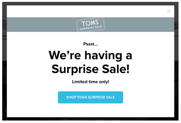
To meet these objectives, they took a simple, straightforward, and specific approach. If you notice, Toms choice of words imply a sense of informal casualness—the way two friends would approach each other—making the communication more intimate. They add a line that highlights the limited nature of the event—thus building urgency.
The overall effect worked to pique customer interest and increase conversions.
3. Purple focuses on the main advantage they offer customers
Business WiFi provider Purple put the spotlight on their main service advantage in their CTA in an effort to increase conversions—the fact that it’s free. They made sure to draw attention to the fact that trying their service is a no-risk / high-reward situation, especially for new customers.
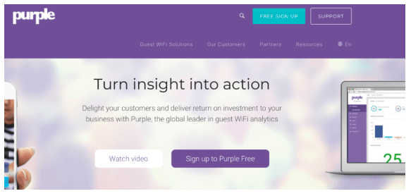
If you are at liberty to provide the same level of service advantages for your product or service, give this technique a try. It’s guaranteed to boost your conversions.
4. Allure magazine leverages on video to tease and engage users
Videos are known to prompt very high engagements among users. However, it can prove to be a challenge to get even engaged users to move from the video to a new site. Allure addressed this challenge by creating interesting content designed to tease and pique the interest of its readers, but held off on showing the final result. To get them to click on their CTA, they invited users to “click to see the full transformation.”
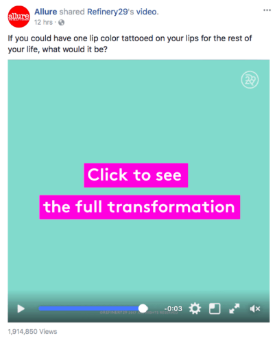
They played up on the drama of their content and highlighted a big reveal, which communicates just how interesting the reveal will be.
So, what do you think? If you need help crafting your own CTA copy, take your cue from any of these examples mentioned above. You can also get in touch with me so we can craft a customized, relevant, and powerful CTA that will deliver the results you need.
Share This Story
Get the latest growth ideas, strategies, and best practices delivered to your inbox.
Quick read that helps 7000+ subscribers.


