Which are the best tactics to tune up call to action buttons to get more subscribers and conversions?

A call to action (CTA) button has one goal: to get your audience to click on it.
Though this is a simple goal, it can be difficult in practice to achieve high conversion rates.
To help you boost your CTA button efficacy, I’ve compiled my go-to tips that I’ve refined through the years to tweak and improve CTA buttons.
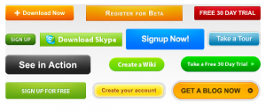
1. Button Colors Matter
The color that you choose for your CTA button is important. Before a visitor to your site even notices what it says, I believe the first thing that will draw their eye to the CTA button is the color, so pay attention to it.
To make sure it’s eye-catching, I try to stick to bright colors for CTA buttons. Whenever possible, I also try to incorporate a bit of color psychology into my CTA button colors. For example, red often implies urgency, while blue communicates trustworthiness. Ultimately though, the color you choose should be based on the overall design of your site or landing page. I would suggest that you use contrasting colors for your CTA button. For example, if you have a blue background, make sure that your button isn’t blue as well so it doesn’t just blend in.
2. Go Big
CTA buttons are meant to be noticed. So, apart from the colors you’re using, it should also be large enough to be seen. I personally tend to stick to basic rectangular shapes, but whatever shape you use, it has to be large enough that it’s hard not to notice.
3. Use Specific, Action-Oriented Text
Going the generic route and using typical CTA copy such as “submit” or “enter” won’t be as effective as action-oriented text specific to whatever your offer is. For example, if your CTA is meant to promote a free trial, you can try “Start Your Free Trial Now” instead of just putting “Free Trial.” Or you can try “Reserve Your Spot Here” instead of just using “Reserve.”
4. Keep It Short
The above examples also show roughly the maximum number of words you want to use. The key is you want to inspire action. You want to be able to spell out clearly what you want your audience and visitors to do so they don’t have to second guess their decision to click on your CTA. However, don’t go overboard by writing out a large sentence.
Phrases that are no longer than about 5 words have proven to be most effective for me. It’s long enough to provide clearer direction, but still succinct enough that it can be read at a glance.
5. Stick to First Person
Studies show that using first person when writing your CTA text can result in much higher clicks. This makes your message seem more relatable and personable to your audience.
While I can vouch for the effectiveness of writing in first person for my CTAs, the best way to learn if it will work for you as well is to test and see how well your audience responds.
There you have it. These tips are easily implementable, so give them a try and let me know how well they work out for you. As always, if you have any questions, feel free to email me at Leadspanda.
Share This Story
About the Author: Prafull Sharma


Get the latest growth ideas, strategies, and best practices delivered to your inbox.
Quick read that helps 7000+ subscribers.