What’s the most important factor in landing page design?
I don’t think there’s a single thing we can identify as the most important factor when it comes to landing page design. The reason why landing pages are effective is because its different elements all work seamlessly together to deliver your desired result. To that end, I would say there are at least 6 elements that you have to consider:
1. A noticeable and eye-catching headline
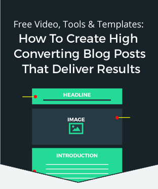
Headlines are essentially the first thing that visitors see and notice once they arrive on your landing page. Effective headlines are able to clearly state the offer and unique value proposition of your brand, product, or service. It should establish consistency to the visitor—meaning they shouldn’t question that they arrived at the correct page after they clicked on an ad. It should also entice your audience enough to continue reading through your landing page.
The font should be legible and easy to read; not too big, but not too small either that visitors will have to strain to read your headline.
2. Always use a relevant image
Landing pages that use high-quality images, especially ones that feature smiling people are known to convert at higher rates. Images help break up the monotony of a landing page. It helps draw reader’s eyes to certain key sections of the page and compel them to focus on important elements, such as your call to action (CTA).
3. Double check the readability of your copy
Your main copy must have a readable and legible font. Artistic fonts with lots of flourishes may look stylish, but if your visitors need to strain their eyes to understand what you’re trying to say, it’s more likely that they’ll end up bouncing off your page than staying to decipher what you’re communicating.
4. Establish trust
Trust is a critical aspect of compelling prospects to convert. If a potential lead doesn’t trust you or your brand, it’s very likely that they won’t sign up for that newsletter or complete that purchase. A good way to address is by adding trust and credibility elements on your landing page. Do you have a money-back guarantee? Make sure that the logo is prominently displayed on the page. Do you have hundreds of trustworthy reviews? Feature the best one on your landing page with a link that allows them to view more.
In addition, if you want to instill trust right before your visitors convert or while they’re considering it, be sure to place your trust indicators near your CTA.
5. Use a lot of white space
It’s so simple that it almost goes without saying, but a landing page should not be cluttered. It should be streamlined and organized. White space should highlight the different elements on your page and minimize confusion. This gives readers more time to actually focus on the choice elements that you added on the landing page that serve to better explain your product or service.
6. Make your CTA very visible
Your CTA button should be a contrasting color from everything else on the page. It should be large enough to call attention and draw your visitor’s eye towards it. Use actionable copy that will communicate a clear benefit so they feel more compelled to click.
Altogether, these elements combine to create a visually compelling landing page that will entice visitors to click yes. Give it a try and let me know how they work for you. If you have any questions, feel free to reach out to me at Leadspanda.
Share This Story
Get the latest growth ideas, strategies, and best practices delivered to your inbox.
Quick read that helps 7000+ subscribers.


