5 Tips to Use Popups on Your Website Without Annoying Your Visitors

Pop ups seem to have been around forever. And with the cleansing of the unsavoury elements they used to contain – seem to be here for the foreseeable future. Clicking on most websites will confirm this!
Cue: collective groan…..but save your breath, and try to lower your blood pressure. The devil that they once were is no more. The sneaky parts are all but removed leaving them more user friendly, smarter, and less annoying. From hells angels to angels. A digital intervention.
By using some of these tips, here is your opportunity to assist in the pop ups road to redemption.
Each and every tip will teach you how to counteract the most traditional and therefore most hated aspects of pop ups.
#1. Show popup at the right time
The worst way to annoy your customers straight off the front foot is to shove a pop up in their face as they enter your site. No “Hello” nor “How are you”? Akin to entering a physical retailer for someone to ask do you need any help. “No thanks, I’m just looking” is the common response – even if they did need help – because it’s too soon!
The potential customer needs to get a look and essentially a feel for your site before they should be encouraged to make any commitments. The face up popup can defer them away from your site in one swift click (bounce rate anyone?) and possibly never to return. They’ll wonder what your e-mails are like if you’re that pushy on engagement.
Tips:
Timed pop-ups are a god send. They can be introduced at certain intervals for when you feel the user has gleaned enough information about you and your site to be nudged in the right direction. Cookie based triggers can be used to ensure that repeat visitors and/or subscribed users are not hit with another pop up – unless you want them to be!
Exit pop-ups are also a great strategy. Low risk too! Users have been given more than enough time to take in your site, and these can be used as a reclaim on users who have exited your shopping cart without buying. One last roll of the conversion dice.
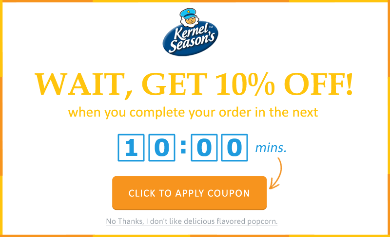
Display a well-timed popup when visitors are abandoning your checkout pages.
#2. Match it with your website design & branding
Nothing screams go away like a badly drawn box. Using the standard template given to you via your popup software is death by default. Historically, pop up boxes were viewed as spam, coming from sites not related to the content you were trying to view. Cannon fodder for the non-click happy.
Having a bad design will drive down sign up rates. If it doesn’t look synonymous with your site, it’s side-lined quickly.
Tips:
Take some time to adjust the pop up box with your site’s look and feel. Careful not to match the colors too closely as it’s liable to blend in too well. Try switching your primary & secondary colors around – stands out, not left out. The fonts, typeface and background all being aligned to create trust and subsequently – traction.

A well-designed popup that matches with your website is less intimidating to visitors and converts better.
#3. Provide a clear & compelling call to action (CTA)
Getting your CTA (Call to Action) right is a crucial part of creating your pop ups. You’ve done all the grunt work in getting and keeping their attention (briefly). Now it’s time to put some hustle behind that clicking finger muscle!
Some popups CTA’s get lost in all the text & content on the display. Some are merged too well. I talked previously about blending into the theme of your website and the trick here is to mix it in and not fade away.
Tips:
Visually it should be the centrepiece of your display box. Incentivise, incentivise, incentivise – giving the users a compelling reason to click. Entice them to want to know more in a suggestive manner – wink, wink! Clicking is their gateway to greatness.
Do not use restrictions or barriers as your main tactic. Telling users they are missing out, or that you will prevent content unless they click will annoy them further. A trade off – you scratch their back, they tickle yours – is much more effective, and fun!
Users are wary of giving details due to being inbox inundated with offers and companies passing their information on. If you are capturing contact information such as email, a simple one line disclaimer stating your intentions can do wonders for your success rate.
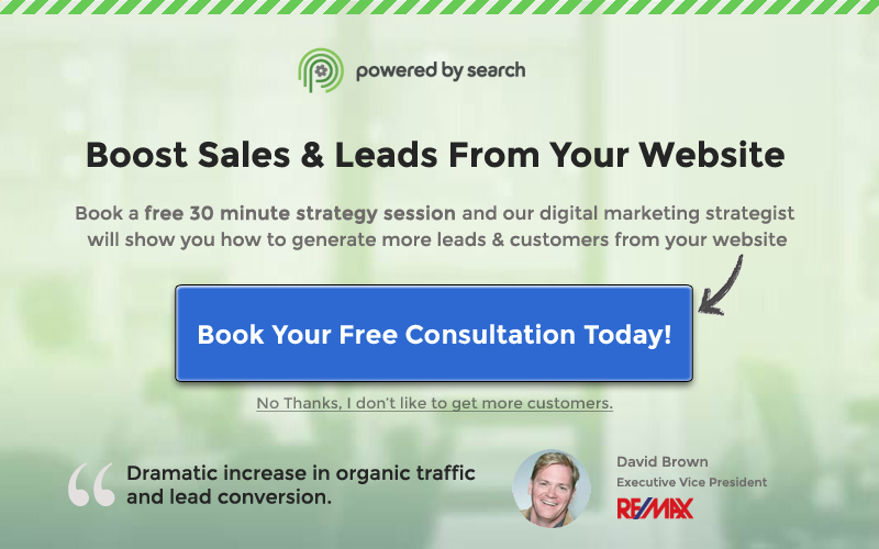
Create a simple but compelling CTA and make it stand out using color contrast and visual cues.
#4. Use fewer form fields
We all know what a pop up wants, nobody is in the dark here. It’s contact information, plain and simple. Although not so simple for some companies; evidently.
A pop up theme is to be in and out like a digital spy, short and sharp. Asking for too much information is a pitfall. Users shouldn’t need and definitely don’t want to spend more than a few seconds filling out any information. The request should be succinct and not require the user to think.
Tips:
Make your info request to the point. Don’t get personal. An e-mail is a standard and expected data requirement. If you need anything else make sure they can click a button or select promptly from a drop down box. You can attempt to gather further information in your planned e-mail shots, where it will be on their time and they are likely to be more receptive.
Offering social media sign up buttons is the ‘thing’ these days. Most people are already signed into one or two accounts permanently – be it on their phone or computer. They can click and go!
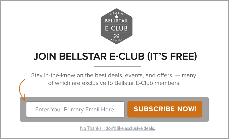
Minimize friction by using less form fields
#5. Provide an exit & Acknowledge the signup
Once people have submitted their details, nothing says thank you quite like a blank screen. Users like to be acknowledged that their action has a reaction, you can achieve this with a simple thank you message and that’ll you be in touch.
Exiting a pop up can also be a big problem. Websites put such an emphasis on their design, placement and CTA that the exit option is little more than an afterthought. Forcing a user to circumvent your popup searching for the close button only serves to further annoy them. No e-mail is worth losing a user from your site!
Tips:
Have close button clearly defined, not so clearly that it is the main focus, but enough for them to at least see it without searching. Users naturally look to the corners for an exit, so it makes sense to place them there. Rejection buttons alongside the Acceptance buttons are a common occurrence – personally I wouldn’t have that, you don’t want to make it too easy for them!
If a user can exit your pop up easily, then they will be more inclined to carry on what they were originally doing – taking an active interest in your site. You may have lost the pop up battle but the customer war is far from over.
Always thank your visitors after they have taken the desired action on the popup. It’s also a best practice to present them with the next steps right there. For example you can let subscribers know if they need to confirm their email address, or you can show them the coupon code if it was a discount offer, or provide them with the download link if it was a book download offer.
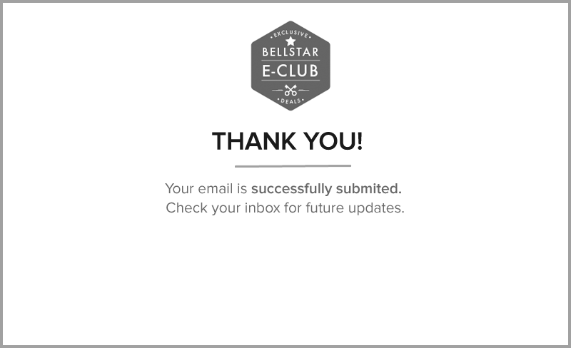
Appreciate the signup and provide next steps.
Summary:
Pop ups are not all bad, they have got a bad reputation in the past but that was mainly down to mismanagement, manipulation and poor implementation.
‘Pop’ ups are becoming more popular as websites use them in the correct manner. Pop ups chance prospects into purchases. Purchases = profits. Popups can be principle drivers of traffic and transactions if used right.
They are becoming part of the norm and people expect to see them on sites. Using all of the above tips and suggestions will make you stand out amongst the rest.
Remember Practicing (popups) makes perfect.
Share This Story
About the Author: Jessica Simmons
Related Posts


Get the latest growth ideas, strategies, and best practices delivered to your inbox.
Quick read that helps 7000+ subscribers.