What are some good colors for call to action buttons?
We all know that well-written, engaging copy, good design, and brand credibility are critical elements that help boost conversions. But what about color?
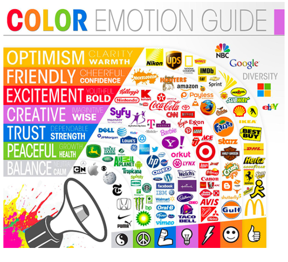
Psychologically, color can have a big impact on your audience. Numerous studies have already shown how the color of a room affects moods. Surely the same concept can be applied by marketers to create more persuasive and engaging call to actions (CTAs).

In all my years in marketing, I’ve tried to crack this color code and figure out what colors are best for CTA buttons. I have determined three that have been most effective:
1. Red
Red is a color that makes your CTA button instantly stand out and pop from the background. It signals urgency, excitement, and passion. So, this is a great color to get people to click on that button.
2. Orange
Like red, the color orange invokes warmth and excitement. It inspires feelings of happiness that often translates to customers being more likely to take positive action on your call to action button. It’s bright and also helps your CTA clearly stand out from the background.
3. Green
Green is a color that inspires calm movement, often associated with the concept of “go”, which motivates a lot of customers to click on green CTA buttons. It implies that it’s safe to click on, which is why it works.
Now, while these three CTA button colors have all worked for me, it’s important to remember that no two businesses are alike. As such, what may work for me may not necessarily work for everyone else. It’s important to test and see for yourself what colors work and don’t work for you. In the meantime, however, there are a few guidelines for CTAs that you should always keep in mind:
1. Make Your CTA Color Pop
CTA buttons need to catch the attention of your audience. It needs to be noticeable and prominent to ensure better conversions. Regardless of whatever color you choose, the contrast of the button to your background should be high so that it doesn’t blend into the background.
2. Streamline Your Color Options
As much as you want your CTA button color to stand out, you still have to consider how it will work together with your whole brand image. For example, if your brand personality is rugged and tough, and you use a pink CTA button—it still helps your CTA button stand out, sure; but it doesn’t align with your overall branding.
3. Consider the Context Behind Your Color Choices
Marketers should also keep in mind that colors likely already have certain associations for users based on context. For example, blue is a color usually associated with hyperlinks. This prompts users to associate the color blue with something that you can click on, making it a more effective choice for CTA buttons. Don’t use the same CTA color buttons for non-action items. It will confuse your audience. If you use blue for your CTA button, choose a different color for your non-clickable headers.
Consider these things when choosing your CTA button colors and you’ll likely see better conversions. Give it a try and let me know how it works out. If you have any questions, email me at Leadspanda and I’ll get back to you as soon as I can.
Share This Story
Get the latest growth ideas, strategies, and best practices delivered to your inbox.
Quick read that helps 7000+ subscribers.


