4 Ways Your Mobile Landing Pages Can Help Convert Users

We’ve talked a lot about landing pages, but we have yet to focus on mobile landing pages.
Take a look around—you’ll notice that a lot of people are doing their surfing on their mobile phones these days. According to a recent study, “mobile devices now account for over 60% of all digital media consumption” And yet somehow, your numbers, when it comes to mobile conversions, still fall way below expectations.
Why though?
It could be a number of reasons, one of which could be that you need to focus a lot more on your site’s mobile specific features, which involves improving your mobile user experience on your customers’ first contact with your site as they browse on their mobile devices—your landing page.
1. Make sure you mobile landing page gives immediate access to important data
If a user is browsing on their mobile devices, assume that they are already on-the-go, that their attention span is going to be short, and that you have a small window of opportunity to let them know what you have to offer.
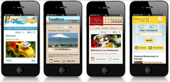
Put the spotlight on your offer by making sure that your visuals draw attention to what you business is all about.
If they land on your site, it’s pretty safe to assume that they are there for a specific reason—and because they’re in transit, browsing quickly using their phone, and are likely doing so while in the car or lining up for coffee, they want to find it as quickly as possible.
- Headline and call to action are very important for mobile landing pages. You have a very brief window to drive your point. Ditch the adjectives and keep it short and simple.
- Make sure your fonts are simple and legible. Don’t be tempted to cram your 2-page company web profile into a mobile landing page. You have maybe around 5.5 inches of screen real estate on mobile screens.
- Quick tip—visit varvy.com/mobile to test how well your site does on basic mobile user experience.
2. Visually, compose your landing page with a lot of breathing space
No one wants to read a wall of text on their desktop computer screens, imagine trying to do so on a few inches of display. Use the limited screen real estate wisely and make it compelling for the readers who are very likely skimming through your mobile landing page.
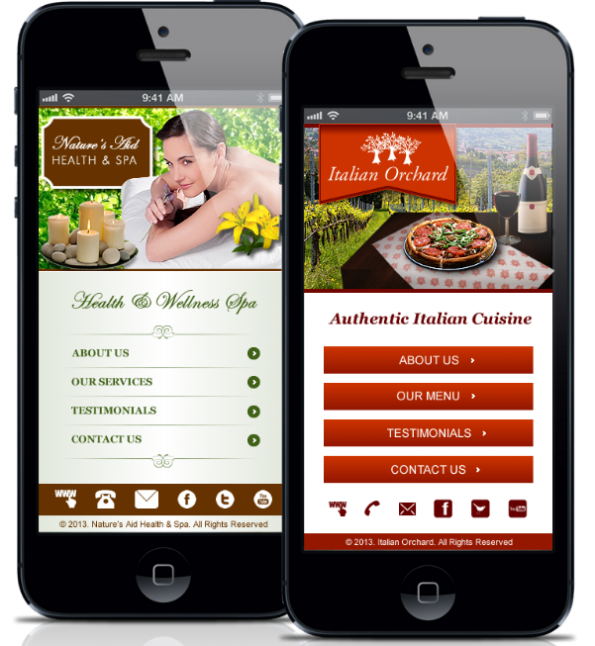
Compose your landing page with a lot of breathing space for easier readability.
- Use relevant images to break up the text.
- White space doesn’t mean you have nothing to say—it conveys simplicity and ease.
- Don’t add clutter to your mobile landing page so that they can easily drill down to your offer when they arrive on your page.
3. Copywise, be more discerning with your use of bullets
You won’t be surprised to know that bullets are basically a go-to for mobile landing pages. But instead of using it to break down your features, be more conscious of what your audience is looking for this time.
Again, your users will be skimming through the text—so get straight to the point. Instead of running down features of your offer, let them know how it will be useful to them instead—these are the information that will catch their attention and drive your point across.
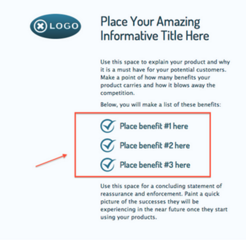
Here’s an example from Wishpond showcasing how you can best maximize use of bullets on mobile landing pages.
- Use visual cues to focus on these bullets so that even if your user has only a few seconds to glance at your mobile landing page, you can draw their eye towards it.
- You can also try using accordions on your bullet points to give your customer the option to click on more details.
- Avoid the adjectives. Less is more when it comes to mobile landing pages.
4. Make sure your mobile landing page loads quickly
Every single component on your mobile landing page can affect how fast it loads on your user’s phone. Every additional element will serve to slow it down and combined with touch-and-go data service, will annoy the customer, making it more compelling to just bounce off than wait for the page to load.
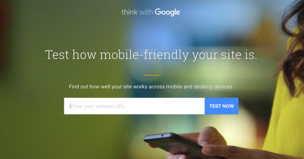
Test how mobile friendly your site is, and check to see if it loads immediately to avoid users bouncing off.
Just a few reminders—
- Make sure you use the right image format. For mobile, JPEG is still the best because it’s supported by almost all browsers. TIFF and BMP files, while great for image quality, bog your site down because of file size.
- Make the most out of image editing tools. There are tons available for download and they can help you lower the image size easily.
- On the subject of images, use it wisely, make it relevant to the information you want to provide.
While there are no hard and fast, or defined rules that you can follow to guarantee that your leads will turn into conversions, these four tips will hopefully make it easier for your users to understand what you have to say and lead to positive conversions.
If you have any more ideas that you’d like to share, feel free to leave a comment below.
Share This Story
About the Author: Jessica Simmons
Related Posts


Get the latest growth ideas, strategies, and best practices delivered to your inbox.
Quick read that helps 7000+ subscribers.