5 Ways You Can Improve Your Pricing Page To Raise Sales

Anyone who runs an ecommerce site should take note of their pricing page. The pricing page is not only the last page a prospect will see before they actually convert as a customer, it will also contain information that will make or break the sale. It is, therefore, one of the most critical pages on your website.
The goal, obviously, is to increase prompt users to actually make a purchase—and here are nine ways you can do that.
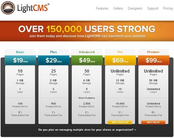
1. Start by providing pricing options…
…but make sure that you find a good balance between providing choices and offering too many that you end up confusing and overwhelming your audience.
Generally, offering three to four pricing plans is the sweet spot. It provide users with a low option, a mid-tier option, and, if they are willing to spend and invest a little bit more, a higher-end option.
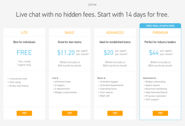
Try to display their options side by side. The idea is to make it simple for your audience to review and compare the different features of each option available to them. Ideally, this would help them determine which plan is most relevant to their needs.
2. Add clever copy for each plan…
…Naming plans will help prospective users associate remember each. The idea is for them to easily recall what plan will come with what features.
Make sure that the copy you use to describe each plan available to users is descriptive and informative. And the shorter and briefer they are, the better.
It’s typical for companies to name their pricing place “A, B, and C.” However, calling it something more descriptive that your target audience can relate to like, “Startup,” “Small Business,” and “Blue Chip” to refer to a Basic, Professional, Enterprise pricing options add more interest and helps with recall.
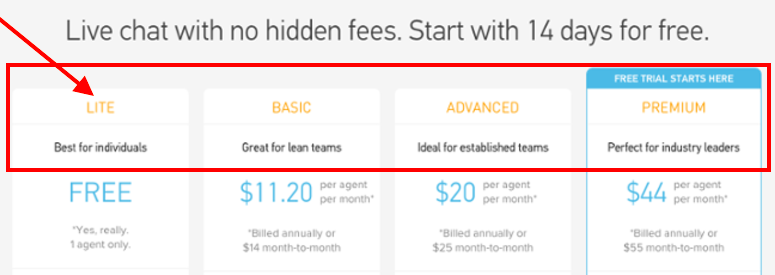
Make sure that you provide a description under each, in the briefest way possible, why each plan is the best choice for their company; and then make it easy for them to select it by ensuring that the select button is visible.
3. Suggest a pricing option…
…and take the guesswork out of your prospect’s decision.
Typically, mid-tier options will address a company’s needs best. And to help speed up the selection process as well as help convert users, try drawing focus on the on a particular option.
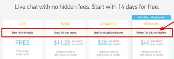
It can be as simple as highlighting the selection with a badge or stamp that says “Best Value” or noting that it’s “Perfect for You” to help users reach a quick decision. Take note, the longer a prospective customer takes to make his or her decision, the more likely it will be that you will lose the sale.
4. Remove potential distractions…
…and avoid oversharing and overwhelming customers with information.
Sure, all these information might be relevant and important to them making their decision. It might even be essential to them converting. But you should also keep in mind that potential customers won’t necessarily care about every single detail.
To that end, you need to carefully parse through the details you want to provide and single out information that is truly relevant to your prospects making a selection and completing their purchase.
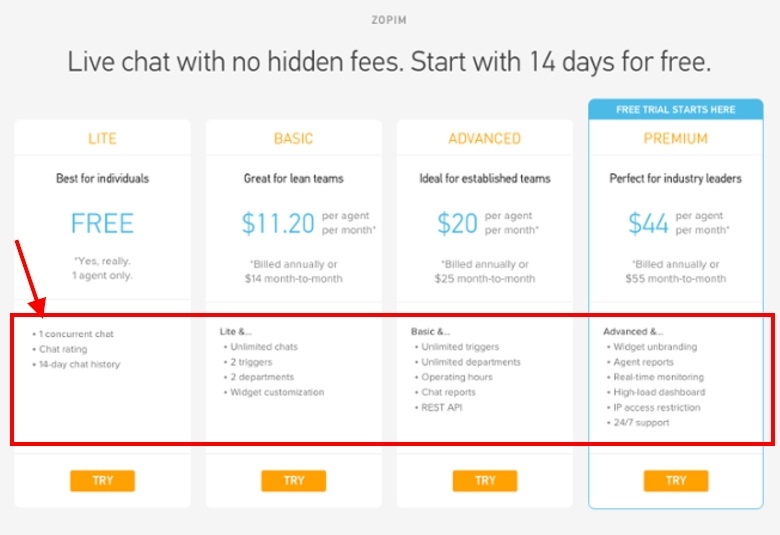
When it comes to designing your price page, understand that simple is the best way to go. A minimalist aesthetic will always be the better choice over a cluttered, crowded page, with elements that could only work to overwhelm and confuse customers.
5. Provide social proof…
…to help build trust among prospective customers.
Remember this—when it comes to making a purchase on an ecommerce site, no matter what amount, a conversion won’t happen if you don’t establish trust with your prospects.
Establishing social proof is the easiest way for marketers to create a sense of trust among customers on their pricing pages. You have the option to add a badge that announces how many customers have benefited from your service, or adding a subhead the clearly illustrates how many people support your site.
Testimonials are also a great way to demonstrate trust. Adding a few testimonials below your options highlight that your company isn’t out to scam potential customers out of their money.
One final note…
After trying all these tips, a key thing to keep in mind would be your call to action (CTA). Make sure that your CTA is above the fold and will be clearly visible to your customers. Don’t make it difficult for the user to figure out what they have to do next.
And when all else fails, try using an exit-intent popup. This is the kind of popup which detects when a user is about to leave a page, at which point it will present them with a final offer before the bounce off. This can actually help maximize leads by incentivizing action or presenting a good offer.
Give these tips a try and see how well it works for your ecommerce site.
For more information about popups and how well they can work for your business, visit leadspanda.com today.
For any questions or inquiries, be sure to leave a comment below or get in touch with us.
Share This Story
About the Author: Jessica Simmons
Related Posts


Get the latest growth ideas, strategies, and best practices delivered to your inbox.
Quick read that helps 7000+ subscribers.