4 Landing Page Best Practices That Actually Help Raise Conversions
Great campaigns begin with great landing pages—this is one of the first point of interactions your brand will have with your users; which means its overall user experience will largely contribute to whether or not they will convert.
An understanding of your specific user wants and needs is important, of course. But despite the differences, know that there are certain standards that will draw positive reactions that lend itself to positive conversions.
Here are some of the most important guidelines that you should keep in mind—
1. Remember your main objective
When you try to bring people to your landing page, remember that it has to deliver on what you promised in the ad that got them there in the first place. Your landing page’s objective is to convert—don’t give them reason not to by making it confusing or complicated.
In terms of user experience, this means dedicating time and effort to make your landing page focused and specific. Just because your ad goes to a specific page on your site doesn’t make it an effective. By far, the most effective landing pages has one page and one purpose.
Take note of these guidelines when creating your landing page—
- Don’t simply use a page on your website as your landing page. To maximize your opportunity for conversions, you will need a dedicated page simply to deliver on what your ad promised.
- Keep the messaging between your ad and your landing page consistent.
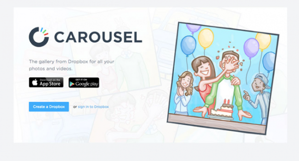
Here’s an example of an ad that doesn’t deliver on its messaging consistently.
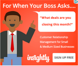
This add implies that it can provide an easier way to build a CRM system between yourself and your customers. Vaguely.
Even if it does compel potential customers to click on it, it simply directs users to the website, where it doesn’t really spell out what your next steps are and it features multiple elements that distracts from the original intent.
Headlines don’t put focus on the action that you want your users to take. Multiple clickable elements create confusion. And the CTA is easily lost within the page.
- Create a focused landing page with one purpose—to convert. Whether its to complete a purchase, bring them to your actual website or sign up for newsletters, make sure that you don’t kill potential conversions by adding distractions.
- Do not confuse your users by asking them to do different things. Spell out one call to action, be specific and focus on that. Offering too many choices will typically lead to your user choosing nothing altogether.
2. Draw attention to what you want users to see
Think of a time that you wanted to make a purchase or sign up for updates. You’re more than ready to finish the transaction or give them your email address, but you just couldn’t figure out what to do next. Where’s the space to add your personal information? Where’s the opt-in button? What did you do after it proved to be too frustrating to make a purchase? You left.
Even with a dedicated landing page, if it doesn’t have user friendly elements that are simple and easy to understand, it will likely be nothing but a usability nightmare. Keep these in mind when designing your landing page—
- Draw attention to your CTA—make it prominent, keep it simple and really take the guess work out of it. Spell out what you want them to do and if you can, illustrate the benefit they can from it.
- Whenever possible, keep the messaging friendly and personal. A prominent SUBMIT button works, sure, but you’re taking away potential conversions by ignoring a more engaging approach. For instance, instead of the usual “SUBMIT” button, which is cold and impersonal, you can do “I want to…” or “Let’s do it!” which helps make your offer feel more compelling. Here’s an example that you can try—
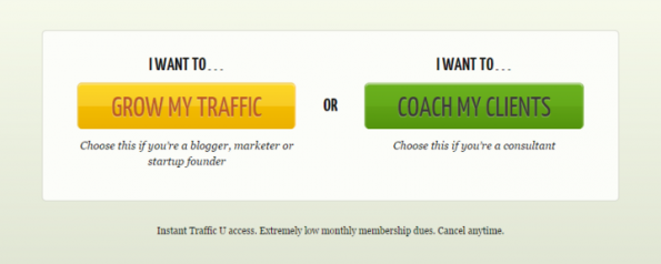
Mix it up and make it more personal–but make sure the options you’re providing highlight how you’re able to address their needs.
3. Note that design isn’t simply about aesthetics
Aesthetics are important. You want your landing page to look professional and reflect your brand personality. But it’s not simply about what looks cool. If it’s not consistent with the messaging from your ad or if all the design elements just complicate your conversion funnel, there’s not much your cool landing page can do to raise your sign ups for sales.
Check out this example of how not to design your landing page–
Where do you go next? What do you click on? What are you supposed to do now? Don’t leave your users asking these question–it’s likely that they will end up abandoning your page altogether.
You’re not trying to demonstrate your eye for design, you want people to take action and convert. How do you do that? Here are some things to keep in mind—
- Focus on a specific audience when you craft the design of your landing page. Don’t design it to speak to everyone. Think of a specific offer, who you’re targeting and design it in a way that it speaks to them—from the visual elements to the copy.
- Avoid gimmicks. These people are pressed for time, have short attention spans and you have a very short window to tell them about your offer and why it’s worth their time. Get to the point.
- Don’t ask for too much. Asking them to fill out a full page questionnaire or go through a 10-step registration process for a discount for example, not only turns users off, it also causes them to question your credibility.
4. Do not underestimate good copy
The kind of language you use, the tone, the style and how you craft it will become a major deciding factor on whether your users will convert. Does it clearly express the benefit of your offer? Does it address their needs? Does it communicate your credibility and expertise to deliver on the said promise?
The example below is an example of bad landing page elements…including bad written content…
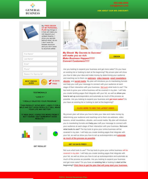
This is a template used as an example to illustrate how bad copy, combined with bad navigation and visuals. What impression does it create for you?
Often, copy is relegated as a minor element on landing pages. Such as shame, considering that a user’s experience on your site is largely dictated by how visuals, navigability and copy work together to provide a simple and seamless conversion experience.
That said, take note of these simple tips to make sure that you convey what you want to say in the best way possible—
- Don’t use jargon. Yes, maybe everyone in your industry knows about these terms—but presume that they don’t. You want to convey expertise in a subtle way, not come off as an annoying know-it-all that wants to assert how much smarter you are—which is all that it does. Use simple words that describe what you are offering. Be direct, go straight to the point.
- Read it out loud then ask yourself—does it sound like something you’d say if you were discussing business or your offer with a friend over coffee? Is it simple enough that you are getting your point across?
- Ask around. Don’t just base its effectiveness on your opinion alone. Ask others to weigh in as well.
Final word—
When you can, test it. There are best practices that have been known to help improve conversion rates, but there are no absolutes. The best way to tell if these guidelines are ideal for your business and your audience is by learning how your users respond to different elements and techniques. What may work for most, may not be the best approach for you, and vice versa.
There you have it—our collection of landing page best practices that help with conversions. Be sure to leave a comment below if you have questions or clarifications.
Share This Story
About the Author: Jessica Simmons
Related Posts


Get the latest growth ideas, strategies, and best practices delivered to your inbox.
Quick read that helps 7000+ subscribers.