4 Design Trends for 2016 to Improve User Experience On Your eCommerce Site
Like any other field of design, the aesthetics that drive credibility and visual appeal for websites come and go.
In the case of eCommerce sites, design trends are anchored as much on your user’s changing tastes as well as advancements in technology; and staying up to date with these trends will ultimately shape the user’s overall experience on your site that hopefully, will lend itself to increased conversions.
For 2016, here are some of the biggest design trends to consider—
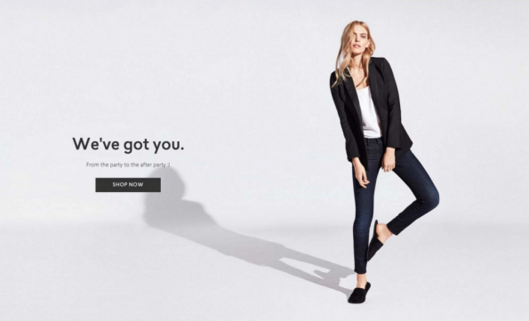
#1 Material Design
Remember when websites used to be all about being the flashiest, fanciest page on the block? If not, that’s likely because 2014 introduced the world to ‘material design,’ and it looks like it’s here to stay.
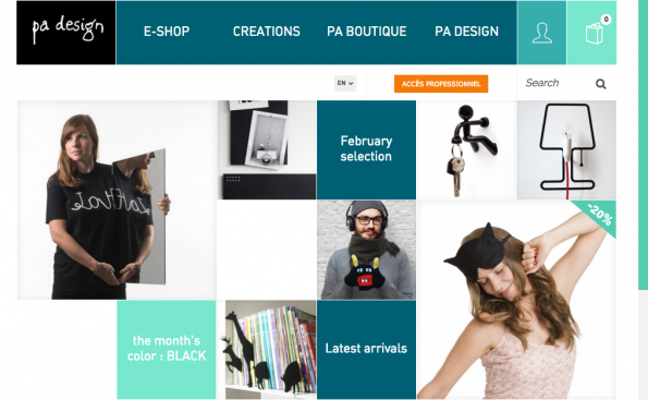
Material design creates a bold and bright layout that draws focus to specific elements on your site.
From start-ups to blue-chip companies, material design has paved the way for a neater, more simplified, digital aesthetic. The overall visual layout thus creates a streamlined design style that makes it easier for eCommerce sites to showcase what they have to offer, while keeping their site engaging and easy to use.
Google, who pioneered the look, credits the aesthetic to years of research that culls the best user interface elements to provide a seamless online experience, that is simple and straightforward.
It focuses on two major design goals:
- Creating a visual language that combines principles of good design with technological innovation.
- Designing a platform that lends itself to a streamlined, unified user experience regardless of platform.
Meaning, everything about the design should be simple and purposeful–whether viewed on a widescreen laptop or a handy smartphone.
A trademark of material design is its use of flat hues that are calmer and easier on the eyes that still make a bold statement. Keep your selections to two or three complementary colours to create a pleasant and consistent theme throughout your site to create contrasts and visual cues.
Use contrasting but complementary colours to create visual cues.
It also veers away from busy backgrounds or animations—this will help draw user attention to what you’re offering. The keyword here is functional. When a particular element is being prominently featured, it has to already impart why it’s there and what it’s there for.
The visual cues should present purpose as much as style.
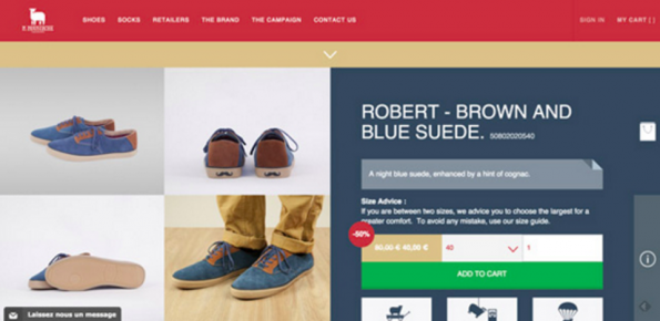
#2 Hidden Menus
Hidden menus’ popularity for eCommerce sites are due to how it manages to clean up the clutter on the page. Originally, it was a way to make efficient use of space for mobile pages but has since been adopted on large and small devices as a way to save screen space.
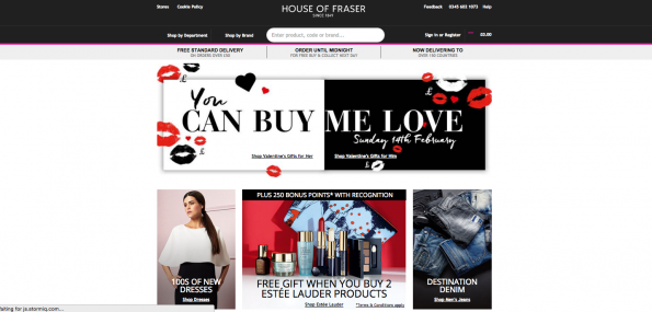
Hidden menus help leave room for space on your page and declutter it.
Following this design trend means you will only be displaying navigational headings. Once they drag their cursor over it or click on it, selections are then displayed. That said, this means you have to make sure that your navigational headings are prominently featured in a straightforward and informative way so your users know where to go.
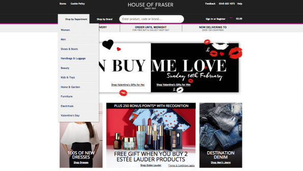
Use clear navigational headings–don’t let your users guess where to go for the sake of good design.
Remember—the goal is to make sure that you maximize limited space while still providing functionality for your users. So, steer clear of vague copy. Direct them towards it by using purposeful words that take the guesswork out of navigation.
#3 Upwardly Responsive
Responsive design has always been an important trend, particularly with the focus given to optimizing websites for mobile use in previous years. But with 2016 ushering in a notable trend toward browsing and shopping online on both portable, mobile devices such as smartphones and tablets, and high-resolution devices such as TVs and desktops, there’s a need to put as much attention on designing for large screens as well.
For example, here’s what the Burberry website looks like when viewed on a large screen–
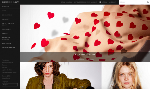
Online shopping trends show that users are now also viewing and purchasing using large-screened devices.
And here is what it looks like when it’s viewed on a smartphone–
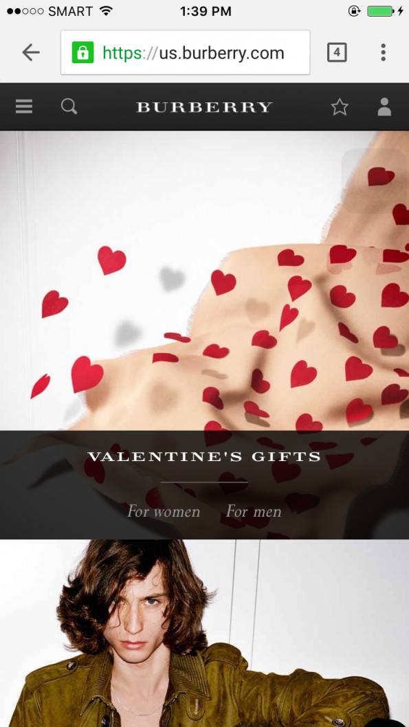
A responsive site lets you enjoy a unified user experience no matter what device you are using.
As you can see, the web design highlights a unified user experience regardless of whether you are using a laptop to browse through the products, or a mobile device.
Over a third of online users will browse eCommerce sites using devices that support a screen resolution of at least 1920 pixels. So this will now require designers to focus on things such as the quality of the images used, and ensuring responsiveness of the layout when it’s viewed on a massive TV screen or a mobile phone. Doing so will ensure that shoppers enjoy a seamless user experience on your site and improve your chances of converting them into paying customers.
#4 Focus on Typography
Content is still king—it has to be informative, relevant and well-written. That’s just a given. But the way you will present what you have to say is just as important. Large and flexible typography that is responsive and can be viewed on a small screen or a large desktop monitor is essential.
Short, simple text executed using large, readable fonts are the going trend for eCommerce sites in 2016.
The trend this year focuses on a minimalist aesthetic. Decluttering the space means that you can pique their interest and develop a strong, visual brand identity that can prompt visitors to explore your site further, eventually converting your users.
Use fonts that are simple and easy to read complementary to brief but well-written text.
Applying these trends on your own eCommerce site not only gives a great user experience, but it also highlights your eye for modern and contemporary design. These trends are as much about aesthetic as they are about function and purpose, so give it a try. Browse through your own site now and see what changes you can easily apply to improve your visitor’s user experience. And if you have any questions, be sure to leave them in the comment section below.
Share This Story
About the Author: Jessica Simmons
Related Posts


Get the latest growth ideas, strategies, and best practices delivered to your inbox.
Quick read that helps 7000+ subscribers.