5 Exit Pop Up Strategies That Can Help Improve Your eCommerce Conversions

Some people hate them, others love them—but regardless of how you feel about popups, the truth of the matter is that they can give you the conversions that you need. Especially when used correctly.
Let’s get even more specific. Exit popups happen to be one of the best ways you can gather your user’s data, raise your blog subscriptions and even convert them to make a purchase or try out a service.
There are multiple reasons why users leave websites without completing a purchase. It could be because your site didn’t offer what they were looking for, maybe they got interrupted or distracted, maybe they were just window shopping or browsing and wasn’t ready to make a purchase. For whatever reason that they decide to bounce, that moment before they close the browser is an opportunity that leaves a small, but effective window for you to re-engage them.
How?
- It presents the user with a “last chance” offer, free of other distractions usually found on websites.
- It offers a platform where you can create a sense of urgency for your offer.
- It simplifies their decision making process.
Again, this largely means you have to present your exit popups the right way. Which is why we’ve compiled this list of practical tips that will allow you to maximize this strategy to increase your conversions.
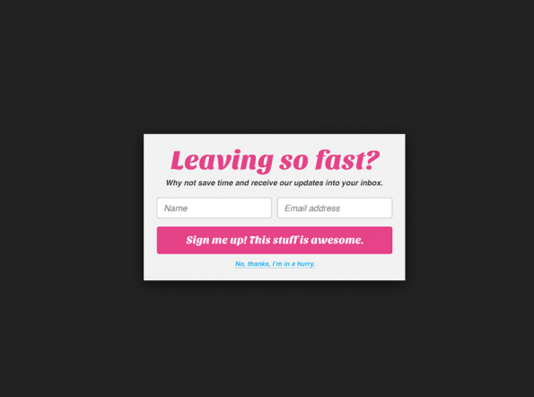
Make them Choose—Yes or No
Questions trigger a response from users. But for this technique to work, keep in mind the mindset that your users are already in. As they are about to already leave your site, you only have seconds to ask them something—will you use it by presenting a wall of text that will take them a lot of time to read and understand? It’s likely they will ignore it (it takes too much effort to read through a lot of copy) and will leave your site any way. Or will you spell out what their options are in the simplest way possible?
To get a reaction, or better yet, the desired response that you need, simplify it for them. Ask a question that will require a yes or no response—and make their options available with a simple click.
For ecommerce sites, the most effective exit popups are ones that inform users about last minute deals.
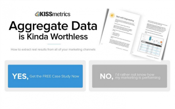
When you only have minutes to get your user to engage, simplify their options for them–ask a YES or NO question.
Consider that—
- 56% of shoppers abandon their shopping carts because of unexpected costs.
- 32% bounce because they think their entire purchase is too expensive.
- 81% are apprehensive about completing a transaction they can’t physically check before finalizing purchase.
So what should your exit popup solution be? Try—
- Offering exclusive and limited-time only coupon codes (Do you want to get discounts for your purchase? Y/N)
- Assuring shoppers with straight-forward money back guarantees (Do you want to leave your email to avail of our pain-free return policy? Y/N)
- Highlight consumer reviews of the product or service (Do you want to know what others say about the product? Y/N)
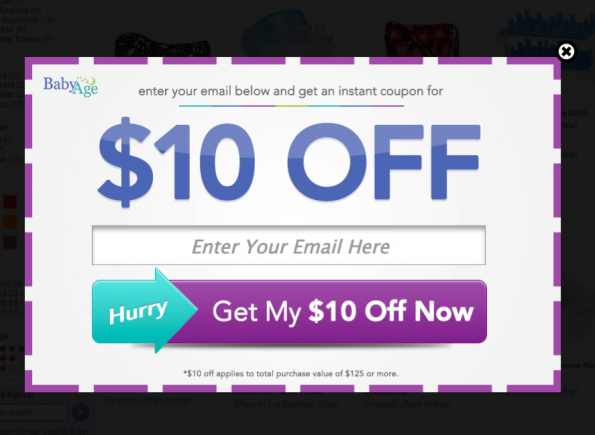
Talk Numbers
Numbers attract attention—whether you use it as a headline, a caption, a blog title, as part of your artwork. Numbers will capture your readers attention by visually, but substantially, breaking up the monotony of text.
Now, psychologically, the more specific a number is, the more believable the impression becomes to your readers.
Here’s an example…
Break the monotony of copy and add some numbers into your exit popups.
The oddly precise number lends a sense of credibility to the site’s claim and makes a very relatable case for users who are about to bounce off the site. It could be the number of people who’ve purchased the same product, number of people who’ve signed up to subscribe for updates…
This also isn’t the only way you can use numbers so that your exit popups more compelling—
- Try adding a countdown clock or timer for an exclusive offer you’re pitching on the popup.
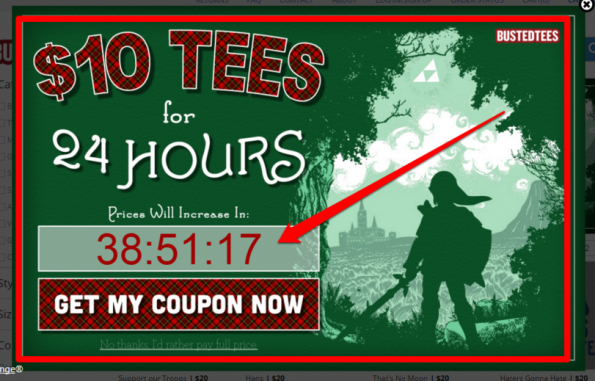
An example of how countdown timers create credibility and build a sense of urgency.
- Inform users of discounts by using numbers.
- Use numbered coupon codes.
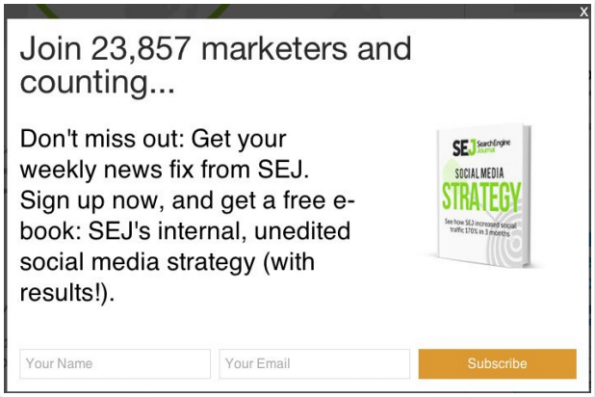
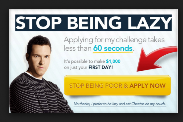
Spell Out Your Call to Action
Minimize the guesswork involved in your user’s decision-making process by spelling out what you want them to do.
On your site, users have a lot of options available to them—they can load up their carts, browse through more items, leave a review, sign up for your newsletter…
When they decide to leave and you use an exit popup to re-engage them, you have a very small window of opportunity to tell them what you want them to do and why they should do it. And this where a good call-to-action comes into play.
Check out these concise and straight to the point examples designed to invoke immediate action.
This one goes straight to the point–we want your email and we’re incentivizing you for it.

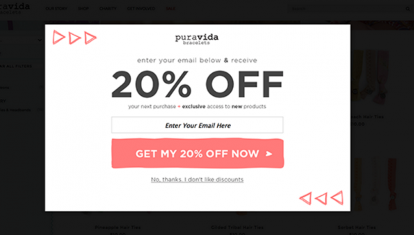
This one highlights a special gift…if they take the first step; thus providing a great platform for reengagement just before they leave the site.
This one questions the decision to bounce of the site, and ensures that they give reason to come back.
Design Matters
Just because an exit popup is essentially your last ditch effort to keep users engaged and therefore get more opportunities to convert them doesn’t mean you can’t put some thought into the aesthetics.
Keep your entire brand’s look, feel and general identity aligned with the visuals on your popup. Furthermore, make sure that basic elements on your exitp popup is enticing, compelling and easily digestible.
- Keep fonts simple, clear and large.
- Make sure copy doesn’t overwhelm the user. Keep it short.
- Don’t overdo the visuals and make it look cluttered.
- Drive user’s eye towards the offer and highlight the positive call-to-action versus the negative.
- Use contrasting hues.
Highlight the value of your offer by making it a prominent feature on your exit popup.
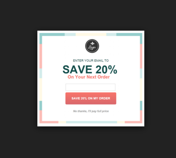
Discounts are a great draw, but so is a visually appealing exit popup.
Provide Shock Value
Exit popups essentially disrupt the thought process that your users are going through as they try to leave your site, which is why an exit popup gets attention. As a user is getting ready to click close on the browser, a window that suddenly presents them with additional options or information effectively captures their attention.
To hold it, offer something with a little shock value—maybe a little-known fact that can dispel longstanding myths—which will not only catch their attention but make them read what you have to say twice, just to see if they understood it correctly the first time.
Capture their attention with copy that they wouldn’t expect.
Of course, do not simply feed information to your users for the sake of creating sensationalized content. At the end of the day, you have to substantiate your claims because trust and credibility are just as valuable to the success of your conversions.
Now, ask yourself if you’re maximizing your site’s conversion potential… and if the answer is no, try incorporating these exit popup strategies a try. Be sure to track how well it does on your site and tell us all about it.
If you have any questions, leave it in the comment section below!
Share This Story
About the Author: Jessica Simmons
Related Posts


Get the latest growth ideas, strategies, and best practices delivered to your inbox.
Quick read that helps 7000+ subscribers.