What are some examples of remarkable landing page copy?

Working in this industry makes me pay closer attention to how businesses craft their marketing material. And more often than not, what really makes me pay attention are landing pages.
Landing pages are simple, short, and straightforward. Yet, they’re expected to attract, engage, and convert visitors to becoming actual customers. A lot rides on how landing pages are designed; the copy that you use; and the visual elements you add.
Here are some examples of remarkable landing pages that I’ve come across recently. Check it out:
1. Freckle
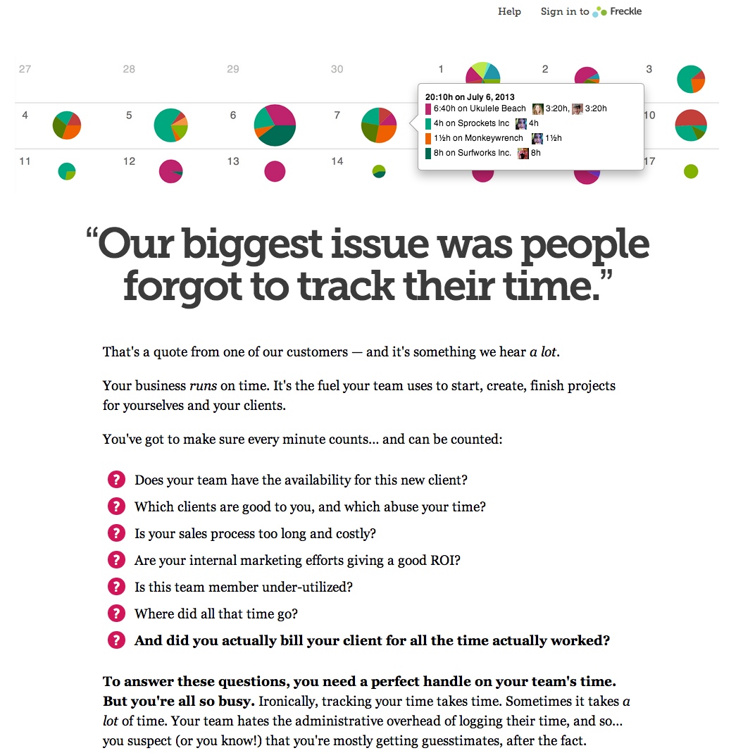
The best thing about Freckle’s landing page is that it brings an immediate focus on three things:
- The brand’s credibility—thanks to a customer quote/testimonial, which is crucial to landing pages.
- The product’s relevance—as highlighted by the main copy, which a lot of potential visitors will be able to connect with.
- A unique approach to copywriting—where the brand highlighted a problem as opposed to a solution.
From there, Freckle goes on to explain exactly what you can expect from their brand. They do so in short, readable sentences, before enumerating further in multiple bullet points.
The whole page features a hero image, illustrating exactly what you’re getting with the software—a brief glimpse of how the platform works.
Overall, it’s a landing page that quickly builds a connection with its visitors.
2.Evernote
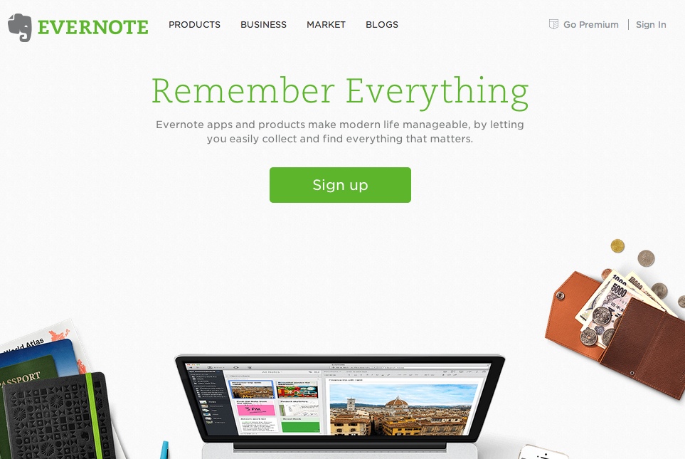
Evernote leverages on simplicity to highlight the solution it offers—and it manages to do so visually and through copy.
- In terms of design, Evernote showcases a lot of blank space on its landing page, with images of things that we use every day to build relevance with its audience.
- The copy “Remember Everything” then emphasizes the initial thoughts you had given the design—that life is complex and can be complicated—Evernote can help you simplify.
- The subhead actually goes into more detail on how you can do that, explaining that Evernote lets you “collect and find everything that matters.”
The entire execution of Evernote’s landing page stays true to the brand’s purpose. It’s simple and straightforward without being vague or confusing.
3.AirBnb
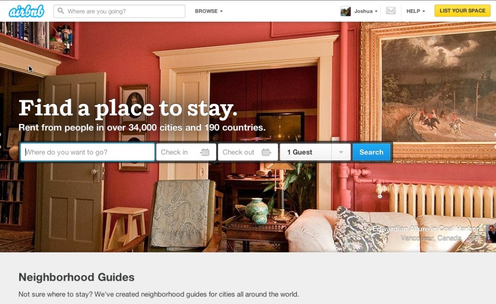
AirBnB is a current business concept anchored on the Internet’s ability to build networks. For younger generations, AirBnB’s concept is pretty easy to grasp. However, older generations may find it difficult to understand exactly how AirBnB works.
- The main headline explains a relatable problem that a visitor may have—this easily builds a connection between the brand and the visitor.
- The sub-headline then goes on to explain what AirBnB is about—“rent from people.” You’re not availing of hotel services and they’re making that clear—you’re finding a place to stay among homeowners willing to rent their spaces out.
- Visually, AirBnB creates a convenient carousel of images that maintains its simple landing page layout, while showcasing their main products.
In addition, the main call to action allows visitors to explore the full range of AirBnB’s reach by inviting users to check and search for available dates in their preferred cities.
These are all based on my own preference. So, if there are others here who would like to share a landing page that caught their eye, I’d love to hear about it. Please leave a comment below and tell me about.
If you’d like to find out what we can do to help you create an effective landing page, get in touch with us today.
Share This Story
About the Author: Prafull Sharma


Get the latest growth ideas, strategies, and best practices delivered to your inbox.
Quick read that helps 7000+ subscribers.